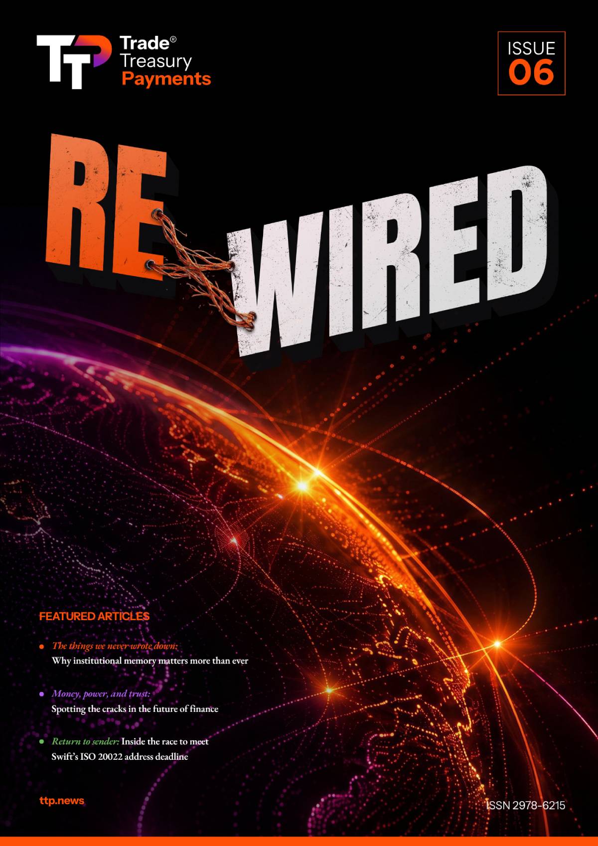
Visitors to our site, readers of our articles, and vodcast viewers (or listeners) might have noticed a few changes recently. There have been some tweaks to our website and the overall presentation of our media content. We have a new TTP logo front and centre, we’ve updated the fonts we use, and our audiovisual productions now include catchy TTP-original sound motifs.
This refresh to our presentation and media offerings has been something we’ve been keen to pull the trigger on for some time and represents an evolution for TTP. It’s a subtle but significant change to our positioning that will carry us forward as we work hard to remain at the cutting edge of an ever-changing international trade finance landscape.
As far as we’re concerned, there are no small decisions when it comes to changes to how you present information when you’re an organisation that prides itself on being the trusted media commentator for a critical global industry. With transparency and trust at the core of our editorial philosophy, we wanted to take the opportunity to talk you through the decisions we’ve made for this refresh and the importance they represent in the identity and the mission of Trade Treasury Payments.
You get one chance to make a first impression
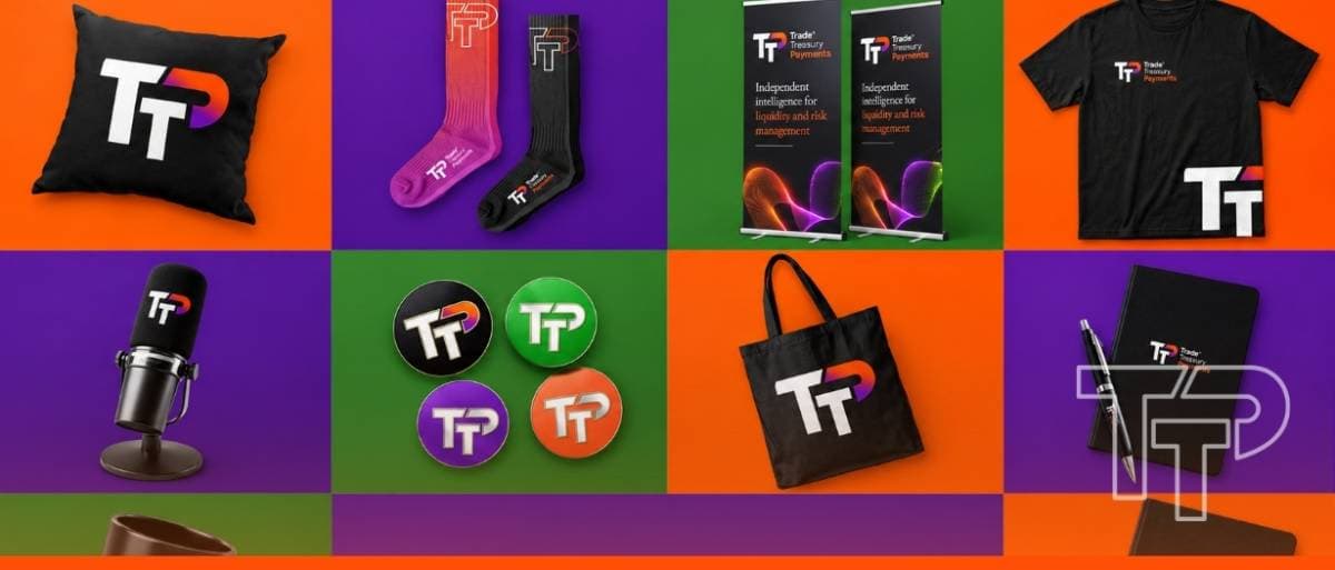
There’s probably no better place to start than with our logo. A logo needs to do a lot of heavy lifting. It needs to encapsulate a brand and evoke everything it stands for. For us, it needed to crystalise an authoritative, instantly recognisable identity and aesthetic that fully meshed with our editorial mission. Simple enough ask for Niño Avisado and Enjel De Guzman…
Core to our mission is the belief that trade, treasury, and payments are three flows of one system, and we’re positioned as a publication that covers them holistically. We assign a colour to each flow: our persimmon orange represents trade, purple represents treasury, and green represents payments. But as these are interconnected subjects, we see these colours as a gradient rather than three distinct blocks. Magenta-violet sits between persimmon and purple, teal between purple and green – each of them shades for flow transitions.
Our new logo subtly incorporates this colour gradient into the ‘P’ portion of our initials, indicating our complete journalistic scope: TTP is where trade, treasury, and payment flows converge. A slight 30° angle to the edges of the lettering creates a sense of kinetic flow – TTP is quite literally pushing forward toward the future. The geometry of our logo design is also such that it maintains aesthetic integrity whether part of a portrait or landscape orientation, and we have colour variants optimised for light and dark backgrounds while retaining the subtle three-flow gradient.
Refined modern elegance for improved readability
Gregor Mihelač overhauled our UX presentation, ensuring that our audience enjoys the very best experience possible when visiting our website. This design project was rooted in a deep respect for our readership and consisted of several subtle, but nonetheless effective, decisions based around optimising the way our content is consumed.
The redesigned ‘Share’ button is an excellent example. It makes use of OKLCH colour technology, which makes colours appear more vivid, consistent, and true to how the human eye actually perceives them. Now, whenever you click that ‘Share’ button, you are treated to a moment of delight, as our editor-in-chief Deepesh Patel puts it (I hope he doesn’t mind me quoting him on that!).
But the most fascinating part of the experience update is the augmentation of our typeface. TTP is a new age publishing company, but we looked to pair classical, authoritative presentation with the science and fidelity of modern design. We use Instrument Sans as our sans-serif font – it’s clean and highly legible at small sizes, making it ideal for interface elements, captions, and navigation. There’s a warm, geometric character to it also that keeps our web content feeling modern, and since it’s a variable font, we have the capacity to fine-tune its weight and width to get it exactly how we want it.
Our serif typeface is EB Garamond, a beautifully faithful revival of Claude Garamont’s 16th-century typeface. Garamond has adorned books and essays and been the vessel for sharing knowledge and ideas since the age of the printing press. The timeless ‘bookish’ elegance of the font was the perfect underpinning for a forward-looking publication seeking to uphold a tradition of independent journalistic excellence and thought leadership.
TTP’s sonic side was calling out for attention
With our visual identity evolving, we were acutely aware that we have never really had an audio identity; at least, not one that exists as a coherent system. This was the challenge put to Cameron Byrom. He was tasked with directing his musical talents toward creating our first, owned sonic identity, consisting of a core mnemonic and a small set of derived audio pieces that would make TTP content instantly recognisable to the ear.
These sounds had to evoke our editorial identity, meaning they had to carry a subtle duality. We wanted something with gravity, translating the heavyweight credibility of a trusted media institution, but combined with a disruptive, forward-looking flair. The result was a new suite of assets to enrich our podcasts and TTP Studios content that are quickly becoming a literal calling card for our unique brand of unmistakable authority.
Our sonic logo lands with immediate presence and gravitas. Cameron has also expertly composed a formidable master track from which intros, outros, and any other musical stings can be derived. The track captures an ambient elegance, with its driving rhythm. It’s kinetic and energised, but somehow also underscored with an inviting lightness that makes it alluring and infinitely listenable. It’s a dynamic musical motif that perfectly fits our character in unexpected ways. It’s also an undeniable earworm! The music is identifiable and repeatable, but in no way repetitive. It’s a fantastic achievement – art with an unmistakable purpose.
Perhaps most important of all, these are all now TTP-specific assets that we own, not assembled from stock libraries. This was vital for our mission of editorial independence. In the same way our journalistic output is not beholden to sponsors, we wanted to be sure our media was in no way dependent on assets we didn’t own. Even the slightest risk that anything we publish could be flagged or removed was too much of a risk. Our autonomy and total ownership of our reporting remain our highest priority.
Why now? And what does the future hold?
This slight overhaul of the TTP branding is something we’ve been planning for some time. Not that we weren’t happy with how things looked and sounded before, but we had these improvements in mind all the same – for us, ‘good enough’ is never good enough. This seemed the right time to pull the trigger on this refresh as TTP looks to enter a period of expansion.
The launch of TTP Studios in North America is on the horizon, and our editorial team will be on hand as media partners at conferences and events around the globe. Our output is only going to grow, and we want to make sure that our branding is optimised to draw attention and properly present our premium positioning in magazine publications, LinkedIn posts, on conference posters and banners, mobile phone screens, merchandise, and wherever else you might see it.
We also see the refresh as a way to future-proof our standing as the trusted source for independent editorial insight in trade finance. We work hard to be both media leaders and thought leaders in an industry that is dangerously close to being left behind. We’re all too familiar with the narrative around some of the struggles of modernising and digitalising the industry – by thinking forwards and proactively evolving our media presence, we hope to be standard bearers for modernisation, supporting the industry through a period of evolution and not just simply reporting on it.
Expect this refresh to be the first of many. Growth is at the forefront of our mindset; we see TTP as an evolving entity and evolving brand, but central to that brand is trust. Any change, major or minor, that can improve how we deliver news and insights to our community is something we will consider. Transaction banking deserves to be represented well by its media partners, and we pride ourselves on doing just that. We are acutely aware that we need to be vigilant to make sure we’re always maintaining the very highest standards that we have set for ourselves.
We’re not as big as the BBC (yet…), but we aspire for TTP to be as ubiquitous a three-letter media entity in the world of trade, treasury, and payments. We will accomplish this by giving the utmost care and attention to every aspect of our media positioning, from the highest levels of our editorial governance to the nuance of the font we put to page and screen.